


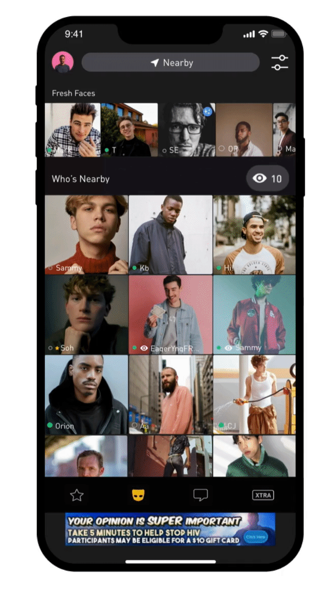
Grindr
Feature Enhancement - Viewed Me
Viewed Me is a feature for those who enjoy the excitement of getting attention from the 5M-daily-active-user-based LGBTQ+ dating app, Grindr, and helps them make instant connections.
Intro
Contribution
Team
PM - Nicole Chu, Theodore Semon
User Researcher - Tyler Benes
Developers - Nester Chung, Wesley Own (Android), Peter Shih, Henry Huang(iOS), Shawn Cook, Munir Estevane(BE), Eric Gnatowski, Yoga Hwang(QA)
Duration
Stage 1: Apr. 2020
Stage 2: May. 2020 ~ Jul. 2020
Stage 3: Nov. 2020 ~ Feb. 2021
Tools
Figma
After Effect
Lottie
Proto.io
Survey Monkey
UserTesting
Roles
Micro-animation Initiatives
UX research
UI design
User testing & A/B Testing
Storytelling & communication
Motion design
Scope
Feature Enhancement
Achievement
By initiating micro-animation to the product team with After Effect and Lottie, Grindr was able to start providing more joyful designs through motions.
I cooperated with a UX researcher for discovering user insights, defining user problems, and conducting user testing to make sure we were solving the real problems.
I negotiated with stakeholders with the user’s behaviors to help move the project forward.
I collaborated with PM and data scientists for iterating the design based on data.
I created documents and tutorials of the initiatives of micro-animation for building trust.
Increased the instantaneity of the feature and aroused users’ curiosity to user viewers.
126.4% (iOS) | 111.4% (Android) of profile clicks on Viewed Me page
109.8% (iOS) | 79.5% (Android) click-through rate from Viewed Me portal
16.7% (iOS) | 9.5% (Android) average revenue per user
13% (iOS) | 9.5% (Android) conversion rate
After
Before
Overview
Problems
People missed tons of potential connections because of the static portal design and the unattractive viewer list.
Solutions
Design


Increase the instantaneity and excitement of being noticed with the animated portal.
Arouse users’ curiosity by providing more meaning of their viewers.

By seeing the profile preview, people are less likely to miss any potential connections.
Free Users' List
Paid Users' List
Special Identities
People now can get more value of their viewers by knowing their specialties.
Informative and enticing portal
Original Portal
Process
We use 3 phrases to finish this enhancement journey because we want to make sure each small step brings the biggest value.
We took each design and research step very seriously so we conducted user testing before each launch, did data analysis to track the performance around the globe, and iterated based on the insights we found.
01
Discover Needs
User Research
Define Users
HMW
02
Define Goals
Hi-Fi Designs
Motion Design
04
Deliver Impact
MVP - Initiate micro-animations
Solution Ideation
03
Develop Solutions
Prototype
User Testing
Ideas Evaluation
Iterate
Data Analysis
Discover
Key Insights
How do people use Viewed Me?
People use Viewed Me as a way to look for instant interactions
Target Users & Traits
We conducted user interviews and data analysis in each session to find the real user problems.
Confident users
Users who are constantly using Viewed Me, tend to give themselves a higher score of attraction.


The static portal made users lose potential connections.
When users got new views, the static portal and number were easy to be neglected. When they went to the list, the best time for connecting had already pasted.
The click-through rate and subscription rate were low
Only 35% of DAU click it even if it’s located in a prominent place. And among those people, only 15% found this feature useful and had paid for it.
People don’t feel excited about previous viewers even though there were a lot
People think the best time to connect is right after they got viewed, so they didn’t have any reason to connect with earlier viewers.
Main Problems

People felt frustrated about keeping seeing the same viewers
Because of the pandemic, people stopped traveling. The location-based algorithm makes people show in the same area
01
02
03
04

Persona Spectrum
Confident
Enjoy the spotlight

Unconfident
Discreet


Define
How might we help confident users be more excited about their viewers and less likely to miss potential connections?

HMW

Develop
Evaluation
Final solutions and strategies
After we brainstormed based on the HMW, we evaluated for the best solutions.


Solution 1
Increase the instantaneity of being noticed by animations and the position of the button
TO
Help people connect at the best time and increase the opportunities for making new connections.
MVP
We started from small. We used the blinking eye icon as a way of initiating micro-animation and seeing users’ reactions to the 1st animated feature in the app.
Blinking eye icon
Expanding button while getting new viewers.
Make the button float while scrolling down from the home page.

A/B Testing

A - Control Group
Positive Result from A/B Testing
B - Experimental Group
We officially initiated micro-animation after we saw positive reactions from users and applied animations to the following solutions.
iOS
+54.8% more clicks on the Viewed Me button.
+64.9% more clicks on the profiles on the Viewed Me page.
+68.8% more clicks of the upsell on Viewed Me page.
+3% more users start conversations
Android
+69.1% more clicks on the Viewed Me button.
+81.3% more clicks on the profiles on the Viewed Me page.
+108.5% more clicks of the upsell on Viewed Me page.
+3.2% more users starting conversations
Solution 2
Provide special identities to viewers to be more attracting
TO
Help people be less likely to miss potential connections with previous viewers
User Research
Users are more interested in…

We conducted user research for figuring out what criteria could make viewers more likely to be connected.
We collected 928 results from a survey that mainly asking “What information about the people in your Viewed Me list would make it more useful?“
Special Identities Design

Based on the research, the three identities were developed to highlight viewers who reach certain criteria.
We didn’t use the 2nd highest metric since we weren’t able to retrieve the chat history.

As-Is
To-Be

Solution 3
Provide a viewer preview on the portal with their profile picture
TO
Reduce the frustration of seeing the same viewers after going into the list
Design Brainstorming
We decided to add a profile preview directly on the Viewed Me button to keep the target user’s prediction and not impact non-target users’ usage too much.

However, while we decided to keep Viewed Me profile preview in the same place, our stakeholders wanted to make it universe and as enticing as possible.
User Testing
Communication is the key to success. Our team decided to explore the true user needs as the best solution.
While Viewed Me became the 2021 most important feature, too many hands were in the projects. Although it made the process difficult, we found the solution of letting users to tell us which direction was correct.
Move it to the tab bar & fancy count-down animation.
Concerns from the design team
The pop-up will be hidden by users’ thumbs
The overly emphasised animation distracted uses’ current experience.
Stakeholders’ Direction

Testing Prototype
Other variations

Testing Insights
From the real user behaviors, we proved the concerns of hiding the button by users’ thumbs & overly distracting them from their task


Deliver
Final Design
By seeing the profile preview, people are less likely to miss any potential connections.
Special Identities
People now can get more value of their viewers by knowing their specialties.

Informative and enticing portal
Users now won’t miss potential connections by seeing the informative and exciting portal and viewer list that tells their special identities.
Result
Android
+3.5% ARPU
+5.2% CVR
+9.19% Viewed me list viewed
+30.15% View profile from Viewed Me Page
iOS
+8% ARPU
+6.3% CVR
+8.52% Viewed me list viewed
+30.96% View profile from viewed me
Takeaways
If I have more time, I would enhance the way of introducing the three special identities. New identities might be confused if users skip the tutorial page.
If I have more time, I would want to explore more opportunities for coming up with solutions at every step.
In stage 3, I appreciated our teammates were so supportive while the designer’s perspectives conflicted with the stakeholders. I learned how to use real user behaviors and words to soften assertive requests and reach users’ goals which is the key to actually meeting the business goal.