

Grindr Store
Successfully increase a great amount of average revenue per user by enhancing the user experience
Overview
Intro & Problem
Providing a good Store for users in an app can allow users to find features or services they need easily and also help products sell better. In Grindr, we also believe it. However, in the past few years, although there were people trying many times to redesign the Store, we haven’t found a version that we consider successful or good use. There were always some parts of the performance that remained to be improved. People are still unable to truly understand what they can get after purchasing, and Grindr still can’t sell our brainchild to users who really need them.
Previous version
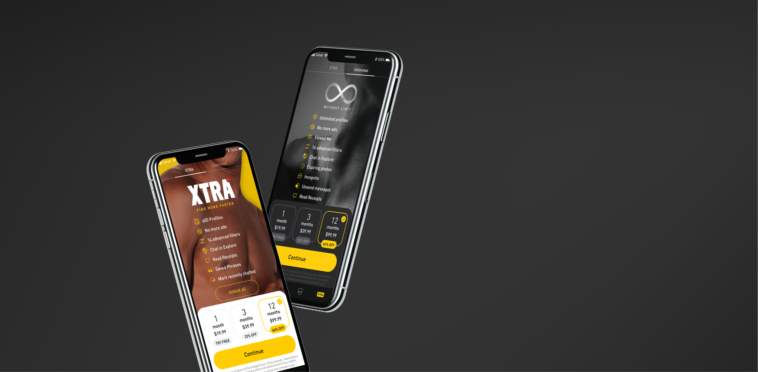
One Previous Version
The Other Previous Version
Less than 7.6% of Android users and less than 1.9% of iOS users tried to scroll down to the middle of the page

Solution
For the aforementioned reasons, we tried to make a basic and clear version of Store with a less-scrolling view to make every key information user care about availability in one glance and leave more space for future enhancement at the same time.
My Role
Product designer
Timeline
Apr. 2021~ Jul. 2021
Team Members
PM: Nicole
Engineers: iOS: Peter, Android: Nester
Tools
Figma, Photoshop
Our Approach
1 . Research
Competitor Research
Previous Versions’ Data
2 . Design
Brainstorming
wireframes
user feedbacks
Hi-fi design
3. Evaluation
Data analysis
My Contribution
First of all, I researched store-page designs of many popular apps and successful products to figure out what a basic store page would look like, which most people have accustomed to and can easily find information from. Also, I read a lot about psychology about human behavior to know how humans’ behavior is impacted by design.
After the research and the analysis of the previous data, I brainstormed with my PM and wireframed down the concepts to discuss with stakeholders and our design team. After many times of design critics, I finalized the hi-fi design and eventually tremendously increased the view of our store page and the purchase completed rate.
Research
At first, I researched many store designs of well-known apps, including dating apps, workout apps, music apps, etcetera, to figure out what the most accustomed and well-performed design will be since I believe users tend to feel more confident paying for products they are familiar with.
Apps I researched


Key Takeaways
In most of them, I found there are common structures. One is having a feature list first and then getting into a subscription plan page. The other is showing features and plans together. In our perspective, we wanted users to be able to see anything at once to reduce as many steps as we can. As a result, we chose the second proposal, the most common one.

Design
Design Goals
Provide users with a less-scrolling basic store page that users can see everything without scrolling on most devices.
Test if the new version store page will have better performance on CVR and ARPU
Increase the conversion rate of subscription and not lower the ARPU
Strategies & Considerations
How to make it look more available?
Minimizing the price counting unite to day or week to make the price looks cheaper
How to reduce users’ concerns before paying?
Show info that users might care about. ex. auto-renewing can be canceled anytime
FAQ page
Eliminate security and privacy concerns
How to differentiate the two plans (XTRA and Unlimited) and guide users to choose a plan easier?
Build Trust: Use social proof or clustering effect on it
Ex. “most popular“, “Best Price” or “90% people choose it”, etc.Bandwagon Effect:
Ex. “Join to explore the 5M people like you here”Visual design
Ex. Compare XTRA’s features amount with UL’s
Are we going to introduce each feature?
- Visualize features by icons or animation, and must be able to browse and recognize easily.
- Most store pages are carousels 🤔, but we lean to make a simple list showing everything rather than switching to see.

Design Challenge 1 - Photo Picking
When I picked the photos for the backgrounds, I guessed the photos with figures' eyes could induce users with more attention. However, after a quick test, I found that clear eyes and faces tend to distract people from focusing on the content in the front. Also, the risk of showing faces in the picture is that people's preferences are objective.
As a result, I eventually used two sexy images of people's bodies and muscles, which got the most positive reaction from users and our employees. (we have about 50% of employees who are LGBTQ+ ).
Hi-fi Design
Last Prototype
I used the parallax scrolling effect to add depth to these pages, so it’s simple, understandable, easy, and intuitive to use but still has details and fun.
Evaluation
Data Outcomes
We successfully increased the Conversion Rate and Average Revenue Per User, and lots of key metrics on both platforms which are unprecedented.
Conversion Rate
iOS +4.2%
Android +5.6%
Average Revenue Per User
iOS +7.6%
Android +7.7%
Store Scrolled
iOS +94.74%
Android +54.93%
Purchase Initiated
iOS +23.35%
Android +30.03%
Purchase Completed
iOS +4.42%
Android +5.21%
Now we can confidently say that users tend to pay for products they feel they can fully control, sometimes it can just be very simple.
Future Steps
Challenge
We successfully increased the CVR, ARPU, and gained a basic store page design structure. The next step will be conducting more tests of small parts of designs in small steps to make Store more robust.
The future plans
Gradually started to test other ideas we came up with during the brainstorming session, like leveraging the bandwagon effect: adding some sentences like "Join now to meet 5M people like you here ", etc.
Try single CTA upsell when users click on advanced features to see if users would be more willing to pay with zero distraction on the upsell page.
What I learned
I learned a lot of psychological knowledge about human behaviors on buying things and how an image could impact users' feelings and mental movements.
Moreover, as an international app with a wide variety of users from different cultures and countries, there are lots of different preferences of people’s looks. It's better to show less the very objective parts on a single image since one image can't satisfy every user.
Lastly, I learned “less is more“ since people always love things being beautiful and offer as much information they want. However, sometimes, being simple and clear can be easier to fulfill the needs.